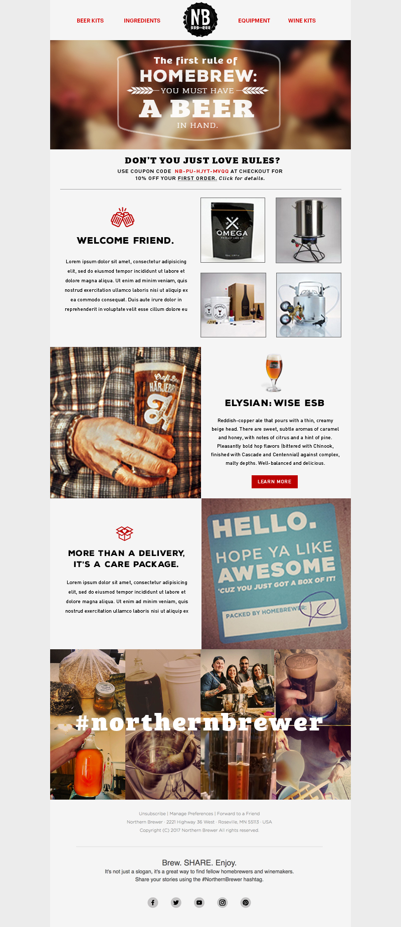
Northern Brewer: activating their active customer base.
When researching, the first thing I noticed was that Northern Brewer has an active customer base. Homebrewers take great pride in their process and equipment and capture the whole thing as a social event. Friends take part, photos are tagged with #northernbrewer and everything is uploaded to various social channels. However these valuable assets were only used in a gallery at the bottom of the homepage. I chose to free these amazing images, put them to use and connect with the dedicated fan base this lucky brand has. Wherever possible, I featured customers using Northern Brewer products. We compensated them with more product and kept the cycle going. Secondly, the homegrown Northern Brewer was recently purchased by the behemouth Anheuser Busch. My design approach keeps NB close to the ground and reinforces that they are still the same dedicated, garage-sharing company they've always been.
AD: Glenn Gray CW: Glenn Gray
Starting from the bottom-up.
The first project was to work on gift cards and stickers. This was a good chance to see how my ideas would resonate without committing to a bigger initiative. I found a look I liked based on the design of some beer labels and I wrote all the headlines and established the voice. The imagery was pulled directly from their social media channels. My goal was to engage the zealots and reward them for their postings. Every photo used, would get them a $25 gift card. They were tagged on the photo and their creation was featured for others to see.
Fortunately, this was met with excitement and we were off to apply this look to their email templates and feature boxes.
Father's Day Gift Guide feature box.
And lastly, I applied my tone to their exclusive recipe kits for a homepage slider within an existing look.


